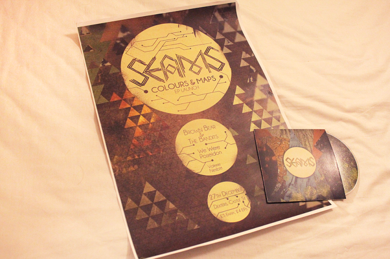
Well, my portfolio’s now looking a little more full. I want it to look varied and full, but I’ve been doing research in how to best present yourself as a graphic designer, and I’ve been reading that more is often less. Wait, less is more. Whatever.
Point is that I don’t want to completely overload it with work, I just want a couple of examples of each medium I’ve worked in. So a couple of EP covers, a couple of photography sets, a couple of illustrative works and a couple of videos. Just a small compilation of work that I’m most pleased with, although seeing it all together on the page there does make it look like a rather odd mishmash of stuff. I’m pleased with some of it and not so pleased with some other stuff.
It’s also apparently a good idea to put slightly different things in your physical portfolio, but I don’t have that much work, so when I sort my physical portfolio out I’ll probably be recycling a few pieces from my tumblr portfolio.
If you’ve forgotten where you can find my online portfolio, here it is:
http://andrewgoldendesign.tumblr.com/
Biggest nagging issue I currently have is that the 3 items that have photos of printed items don’t quite match each other in terms of colours. Obviously in my room I don’t have the most flattering or practical lighting for taking photos of my printed work, so every photo has come out a bit different, which annoys me a decent bit. But guess clients, and even yourself, won’t really care too much. Just a small annoyance.
But I’ll try to keep you up to date with how the building of the physical portfolio is going. I want it to be something that stands out from the sea of innevitable black folders that folks at Duncan of Jordanstone innevitably come across when interviewing folk. But at the same time they’ll maybe want to keep it, so I don’t want to invest a mad ammount of money in a case, just for them to steal it off of me. I’ll wait and see.
Anywho, on a side note instead of doing my usual “Listening to” bit at the end of every blog post I thought I’d welcome in the New Year, by giving you my top ten albums of 2011, a bit at a time. Yep, I’m some sort of odd chart tease, but deal with it. But here goes.
The 10 of ’11
10: Gloss Drop by Battles
Battles were a critic’s wet dream back in 2007, when their debut ‘Mirrored‘ came out. But with a release so odd it was hard to see where they’d go next, how music already so alien could morph anymore. Yet somehow the New York trio’s sophomore release is even more surreal and other-worldly than its predecessor, yet in a completely different manner. Whereas Mirrored was coldly spatial and ominously atmospheric, their new material seems brighter, shinier and popier, perfectly exemplified in single ‘Ice Cream’. They’ve put out a far more danceable, yet no less brilliantly confusing experiance.

Are you applying for a course at DoJ? I’d stick with a standard black portfolio but personally I favour an
A3 number over the usual A2.
‘Tis indeed, applying for Graphic Design, to go into 3rd year. Probably would just be best to stick with the standard black portfolio, showing off would probably only do me favours in industry… and I don’t have any A2 work, so an A3 one would make sense. Where’d you get such a folder?